abstract map of wellington with pie charts and percentages showing travel types into the city

We live in an increasingly complex world and are bombarded with information 24/7. To have any chance of catching and holding a customer’s attention it helps to be very clear about what you want to say and present that information in an eye-catching or easy to digest form.

Infographics (or information graphics) is described by oxfordreference.com as “visual representations of data, information, or concepts.”


A recent article by The Guardian, about New Zealand’s clear messaging during the Covid-19 pandemic, highlights how important it is to have a clear communication strategy and how it is delivered.

“Information design may seem a superficial front by which to assess a pandemic response; but whatever course a government chooses to take against the virus – whether it be elimination, control or herd immunity – it is effective only insofar as people understand it.”

One example they reference is the use of simple black and white pictograms to illustrate public health directives, chosen for their inclusivity, compared to examples of less successful campaigns in other countries.


illustration of public health messages

‘Unite against Covid’ public health illustrations.

While most projects do not have the same pressing importance as a government’s pandemic response, using appropriate infographics will often help people understand the story you want to tell them.

Infographics can be divided into three basic types:

  • Data visualization (charts, graphs etc)
  • Information design (concepts or other information, such as process, anatomy, chronology, or hierarchy.)
  • Editorial infographics (graphic content to replace more traditional editorial features)

Example of editorial infographic from www.good.is/infographics

Part two of this blog can be read here.

Colour illustration of a prawn

When I got involved in producing a book project recently (see my blog’s about this here and here) I thoroughly enjoyed creating some collage illustrations. During the process I revisited some favourite stock libraries for images and even discovered a new one!

There are heaps of stock libraries, but I like the following ones for their ease of use, great images and user-friendly licensing conditions. Always, always, always check out the licensing info before using – you don’t want to inadvertently find yourself in hot water!

My top picks for free sites are:

  • Rawpixel 

    rawpixel.com This is my new discovery and includes some “fantastic public domain and vintage design resources with a CCO Licence”
    CCO = Creative Commons licence (see explanation below!)

  • Unsplash

    unsplash.com for some beautiful images “powered by creators everywhere”

  • Pixabay

    pixabay.com

  • Pexels

    pexels.com


website page showing a stock photograph of a Marae roof in front of a blue sky

And great paid sites include:

Painting of older woman's face with black background.

Detail of Mme. François Buloz (Christine Blaze) (1879) by John Singer Sargent from Raw Pixel.

Don’t get caught out

As mentioned, different sites have different licensing requirements always check the license to make sure your intended use of the image is covered.

  • Many sites like unsplash encourage the use of photo credits to the contributors.
  • The Creative Commons licence: “enables scientists, educators, artists and other creators and owners of copyright- or database-protected content to waive those interests in their works and thereby place them as completely as possible in the public domain”.
  • You don’t get exclusive use of stock photography so some popular images can get used extensively. Stock images are great but if you need unique images for your business hiring a professional photographer can be a great investment.

I hope these tips help.

google search page

A popular images from unsplash that crops o=up in lots of places.


Different design projects require different colour systems depending on how they are being produced. In a brand guide for example, there will be usually be CMYK and RGB values for the different brand colours. What’s the difference between them and why do we need both?


CMYK is created with ink

A full range of colours are created by adding physical Cyan (bright blue) Yellow, Magenta (bright pink) and Black inks on white paper.
Any project that will be physically printed with ink rather than on a digital screen.

CMYK values range between 0 – 100.
No covering of ink = 0
100% covered of ink = 100


Black (completely covered in ink) has a value of:

C: 100

M: 100

Y:100

K:100


While white (no ink) has a value of:

C: 0

M: 0

Y:0

K:0


Please note: There is a minimum and maximum value of ink coverage for the best printing result. General guidelines are not going below 10% for minimum ink coverage or over 280 -300% for maximum ink coverage but will depend on the type of paper or ‘stock’ being used.

Some colours can’t be reproduced using the CMYK system (such as fluorescent orange or reflex blue) . Another option is a“spot colour “ using special inks in the Pantone colour matching system.


RGB is created with light

Starting with a black digital screen Red, Green and Blue light are added to create colour.
Anything that is created electronically for a digital screen uses RGB colour.

RGB values have a range between 0 – 255 for each colour denoting the amount of light added.


Black (no light) for example, has a RGB value of:

R: 0

G: 0

B: 0


Whereas white (maximum light) has the highest value for red, green and blue lights, creating white.

R: 255

G: 255

B: 255


Please note: Some colours that look bright and vibrant on screen are hard to recreate physically with CMYK ink. Especially bright orange and some light turquoise blues.

Feel free to get in touch if you have any colour queries.

Pages from an open report on a grey background

Factors driving a public sector design project can be quite different to those in the corporate or business world.

This is because:

  • of accountability to rate payers and tax payers
  • projects are often community-based and grassroots which can require accessible design and different languages
  • it’s about communicating information rather than driving sales
  • things take time to get through the approvals and sign-off processes
  • projects can be political and perceptions may influence design decisions.
Page from a document showing pull out quotes

Feedback quotes from consultation participants shown in Porirua Development/Kāinga Ora’s Community Engagement Report.


There’s a lot of design staples in the public sector – here are three types I most commonly work on.

  • Regulatory documents like Annual Reports and Statements of Intent
    These usually are published within a prescribed timeframe and have to contain specific information. But as far as design is concerned, and certainly in the front half of these documents, there’s room to reflect the organisations character and reflect its values. I’ve written a blog about ‘The anatomy of an annual report’ which has some more information and design tips on how to make it look great!
Cover and inside page of an A4 document shown on a grey background

Wellington Water’s Annual Report designed within their existing brand guidelines.

Document Design Wellington

Pages from Wellington Water’s Statement of Intent.


  • Infographics
    A picture tells a thousand words – and that’s the role of the infographic. Maps, graphs, charts, diagrams, icons, illustrations, pull-out quotes and numbers are all great ways to help make often complicated information more digestible. The ‘Wellington Regional Growth Framework’ is packed with facts and figures and uses lots of different types of maps, diagrams and schematic to demonstrate them. (https://wrgf.co.nz/reports/)

Pages from the ‘Wellington Regional Growth Framework’ Foundation Report showing demographic statistics through graphs.

Pages from the ‘Wellington Regional Growth Framework’ Foundation Report showing access to opportunities.


  • Promotional work including posters, invites and social media tiles
    Consultation is often required and many projects I’ve worked on have a community consultation component, often involving open days or events. Designs work better when they consider the neighbourhood and the communities within it. Printed posters and physical invites /flyers often compliment social media promotions. Maps or diagrams often feature to explain the options being proposed and to prompt comment and feedback.
Invite showing a photo of a child riding a bike

Invite to a safer cycling community working hosted by Kapiti Coast District Council using their brand guidelines.


Facebook Event image

Facebook event banner for a community event.


Kapiti Coast Map Design

A map used in public consultation about speed limit changes proposed for Kapiti Coast District Council roads.


Usually local government, council controlled organisations and other public sector organisations have established brands. I can provide both brand strategy advice or be a virtual “in-house” designer and custodian of existing brand guidelines. My well organised document management system means I can easily retrieve that job we worked on five years ago so we don’t have to start from scratch for a similar project.

If you have any public sector design questions, feel free to get in touch.

We’re all human, and it seems emotion and unconscious thought is what really drives decision making, and by extension our spending choices. Colour is an emotional cue and has a major effect on buying behaviour.

How does colour influence emotion and by extension your customers and sales? I look at:

  • Psychology of colour
  • Unconscious decision making
  • Colour in branding

Colour psychology is a good place to start.

Wikipedia describes colour psychology as the study of hues (colours) on human behaviour. While the influence of colour on individuals can be subjective and may be affected by culture, gender and age, some aspects are considered more universal.

You’re probably already familiar with some broad categories of colour psychology.

Colour wheel graphic on a white backgroundWarm colours, including red orange and yellow, evoke emotions ranging from feelings of sunny warmth and comfort to more passionate feelings of anger and aggression.

While cool colours, like blue, purple and green could be described as calm, secure and tranquil but can also feel cold and sad.

Colour can affect mood and therefore change shopping habits.

Colour is a powerful communication tool and can be used to signal action, influence mood, and even influence physiological reactions.

“Selecting the right colours to use has an enormous impact on product sales.” (J Suresh Kumar). One high street example of this is the prevalence of red and yellow in the logos of popular fast food chains. Also known as the ketchup and mustard theory; that red and yellow are a combination of colours that encourage us to eat.

Think about the advertising panels and logos of McDonald’s, Burger King, KFC, Wendy’s and Pizza Hut. Their logo colours would suggest they all strongly subscribe to the ketchup and mustard theory.

Close up of hands holding a hotdog with ketchup and mustard

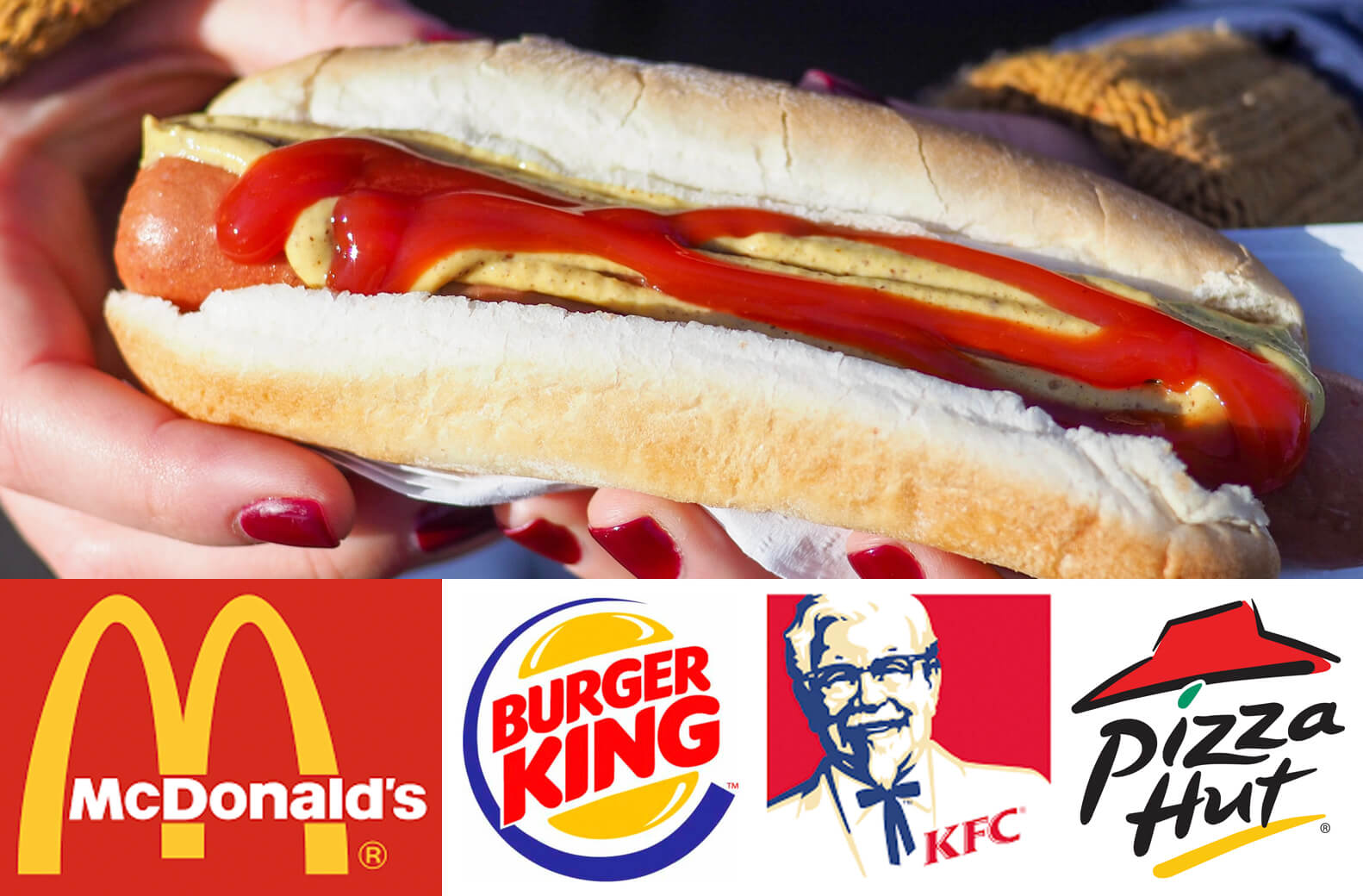
Hotdog Photo by Peter Secan on Unsplash

“Yellow is a symbol of happiness, excitement, and cheer and red is an attention seeker causing triggers of appetite and hunger. Red makes us feel warm, loved and comfortable which is necessary for a good long meal. Yellow grabs our attention from a long distance and it also increases the speed of our metabolism.

Experts believe that the combination of these two colours create the perfect combination of emotions and feelings to make people feel hungry and spend more time while having a meal.”

Unconscious decision making

Probably 95% of all cognition, all the thinking that drives our decisions and behaviours, occurs unconsciously—and that includes consumer decisions. That’s not to say that the 5% we’re privy to is unimportant—just that marketers overemphasize its importance, because it’s so visible and easy to access. (Harvard Business School professor, Gerald Zaltman)

If humans aren’t as logical as they think they are, and colour can suggest certain emotions it makes sense that colour can be a powerful marketing weapon. While showing rational features and services remain important tapping into an emotional response can get results.

“As the old saying goes – sell the sizzle, not the steak.


Colour in branding

“When brands effectively reach customers on an emotional level, this deeper relationship builds the foundation of brand awareness and can even change shopper habits.” Branding is about making connections to your ideal customers and building a relationship that will affect their buying decisions. Creating a resonance between what you offer and what your customer wants or needs.

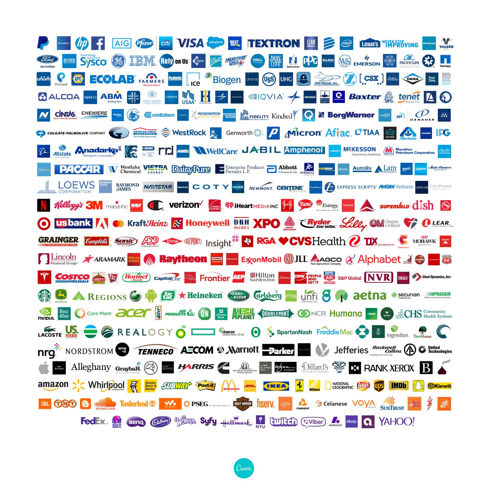
Colour is a key part of branding, and colour psychology can be a great help. You need only need to look at how popular blue is for Fortune 500 companies logos. But, let this be tempered by your particular ideal client. Their cultural or social background may change what resonates for them.


Fortune 500 business logos arranged by colour

www.canva.com/learn/color-psychology-the-logo-color-tricks-used-by-top-companies

Pink may be associated with women’s products in general but it could easily be a turn-off for the specific women you want to appeal to.
How we present our businesses or products should resonate with our ideal customers and a good branding exercise will think about colour alongside:

  • What you do (products, services, features)
  • Your background/story
  • Your competition/market
  • Your key messages (Benefits to your client, values)
  • Personality, words and voice
  • Typography and Imagery

If you’d like more information about colour and branding please get in touch.


References:

  1. www.verywellmind.com/color-psychology-2795824
  2. The Psychology of Colour Influences Consumers’ Buying Behaviour – A Diagnostic Study. J Suresh Kumar, Ushus-Journal of Business Management
  3. www.marketingmind.in/know-fast-food-logos-red-yellow
  4. www.inc.com quoting Harvard Business School professor, Gerald Zaltman
    https://hbswk.hbs.edu/item/the-subconscious-mind-of-the-consumer-and-how-to-reach-it
  5. https://insightsinmarketing.com/resources/infographics/how-does-color-affect-consumer-behavior/)
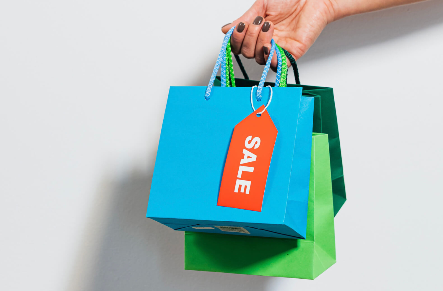
As mentioned in my recent blog I’ve recently become involved in a project to co-author The perfect recipe for creating awesome web content. As the title suggests it’s a book about writing content for small business websites. Angela Bensemann and Iona Elwood-Smith approached me to contribute to their project. What started out as just a cover design became a larger undertaking.

While I’m experienced in document design I’ve never worked on a book before. We decided to concentrate on a physical book in an easy-to-hold size (6 x 9 inches or 152 x 229mm), an A4 downloadable PDF version and some bonus A4 PDF worksheets. Unrestricted by epub limitations of an ebook I let my creative hair down and came up with illustrated section breaks, pull-out boxes illustrated with photos and engaging worksheets.

Colourful collage illustration showing a smiling woman, cake and bird

This collage uses free stock images from Rawpixel.com and Unsplash.com

Here are ten of the conventions and elements that I came across while preparing the book for print (some details new to me!):

  1. Cover and Title Page: The title page is often the first right hand side page inside a book and shows the title, author and publisher.
  2. Copyright page: This follows the title page and includes information on the author/s, copyright, publisher, ISBN number (more on this in point 6) and can include design details.
  3. Dedication: A chance to make your mum proud!
  4. Numbering: Odd numbers are always on the right-hand page.
  5. Section heads: Not common in fiction but as this was a non-fiction “how to” title it made sense to go to town with the full colour printing and create fun collage illustrations for each section.
  6. ISBN number: This is a unique International Standard Books Number which in New Zealand is issued by the National Library for free. We found we needed to decide which formats we wanted to produce (hard copy, soft copy, epub etc) and apply within eight weeks of publication. More details are here ((https://natlib.govt.nz/forms/isn))
  7. Barcode: If you’re selling in a retail setting, you’ll need a barcode. There are various types and you’ll need your ISBN number. We took advice from our author friend, Susan Holt, and purchased an EPS file from the Label Shop which I added to the back cover design.
  8. Spine: Don’t forget the spine design. Wording usually runs from the top of the book down. The size of your spine will depend on your page count, the type of paper used, and the type of binding used. Your printer will be able to advise you. We used the handy spine calculator on the Your Books website. This also allowed us to include other measurements to calculate the final cover size of the cover artwork (including the front cover, spine and back cover).
  9. Printing specs: How your book is printed will have an impact on your book design. In our case we chose a digital full colour cover with a matt laminate (the advice was ‘it’s not a romance novel so you don’t need a gloss cover’!) while the inside uses a highspeed inkjet process. As the cost was similar we opted for colour over black and white. It was late in the day that I learnt the inkjet process has limitations compared to normal digital or offset printing. Apparently inkjet printing works better with small areas of bright colours. Not the large areas of paler shades I’d designed. Luckily, we opted for a printed proof which allowed us to check out which design elements would work or need to be tweaked to suit the printing process.
  10. Photography: A professional author photograph will help you look the business! We had a full photoshoot with Juliet Watterson Photographer so we could get some good shots of the authors for the book and also for our Collaboration Station website and social media sites. The photographer is often credited on the copyright page, next to the author photo or back page. Reference to the source of stock images used in the cover art may also be mentioned.
Head and shoulders shot of a woman smiling

Author photograph by Juliet Watterson Photographer (www.julietphotographer.co.nz)

I’ve heard it said that writing a book is only half the job, with printing, marketing and distributing being the other. There is nothing like a final printer’s proof to focus attention on the job at hand. A book, and all the jobs I’m ever involved with, will always benefit from a fresh pair of eyes to check for hidden spelling mistakes, funny spaces and any other inconsistencies. Luckily for us our helper spotted a couple of things that we were able to update before hitting the “approved, ready for print” button.

I hope these tips will help if you’re considering producing a book.


While there are no absolute rules, there are some common practices for numbering a document that will be physically printed.

1) Position of odd and even page numbering

Start the numbering on a right-hand page so odd numbers (1,3,5…) always fall on the right-hand page of a spread and even numbers (2,4,6…) are always on the left.

2) Not numbering the Cover and front pages

The Cover and some initial content such as a Forward, Dedication and Copyright page appear before the main content. The Cover (and Back Cover) isn’t numbered and other initial pages are traditionally labelled with small Roman numerals (i, ii, ii, iv…) or not at all.

3) Blank pages don’t need numbers

Sometimes blank pages are added in the main content of a document for design purposes, such as allowing a section to start on a right-hand page. These pages are still in the numbering sequence but the number isn’t printed. For example, page 11 and page 13 have written content but page 12 in the middle of them is left blank. Page 12 is still counted but the page number isn’t printed. Blank pages may be added at the end of a document to make up the page count. All printed documents need to have a page count divisible by four because documents are created by folding paper in half to create 4 pages.

4) Position of page numbers

Avoid placing page numbers on the inside margin of a page, or too close to the outer edge (where they might get trimmed off). Usually page numbers are placed in the bottom right and bottom left of a spread. For design purposes they could also be centred at the top or bottom of a page, placed in the top right and left corner or centred on the outer left and right sides. Consider your audience and what sort of document you are producing when placing your page numbers. If your document is large and your audience will need to navigate back and forth through the document to find specific information make your page numbering easy to read and find.

If you have any page numbering questions, feel free to get in touch.

Large format display sizes compared to a human silhouette

Sometimes bigger actually is better. Many occassions, like trade shows, construction projects or events, may require larger format displays to be designed.

These tend to be less standardised that the ‘A’ paper size system and may differ slightly from each supplier. Pull-up banners and flags can vary so it’s important for you, or your designer, to get the correct specifications from the signage company, printer or supplier to ensure the artwork is set up to their particular sizes and requirements.

To imagine how large a pull-up banner or flag would be in the real world I’ve used common sized items in this visual as a starting point.

Large format display sizes compared to a human silhouette

Coreflute, and other signage materials, come in standard sheet sizes. Unless you need a specific size, working with standard sheet sizes (such as planning to use a half or quarter sheet) will reduce wastage and can be more cost effective.

While coreflute is light and inexpensive it has a limited shelf life so is ideal for short-term use. For signage and displays that need to be durable and last longer term Aluminium Composite Panel (ACM) is popular and can be digitally printed and cut down to standard sizes and shapes.

For help visualising standard ‘A’ paper and poster sizes check out my ‘A’ what? blog.

Standard poster sizes in relation to a person's silhouette

Most of us are familiar with an A4 sheet of paper, but it can be harder visualising how large an A1 poster will look or how an A6 postcard might fit into your hand.

Here’s a handy collection of all the ‘A’ paper sizes together measured in mm, as well as a standard business card.

Standard paper sizes A6 to A0

And just to give it some scale – here are A3 to AO posters next to a silhouette (in this case me!).

Standard poster sizes in relation to a person's silhouette

For more info check out my blog on visualising even larger format displays here.